Friday, 25 January 2013

Evaluation of Personal Project

HERE IS MY EVALUATION FOR THE PERSONAL PROJECT.


Our brief had to link in with our previous project of the CD project. I decided to link it to music. I had three main ideas that I possibly wanted to create for the personal project, these were a range of typography posters, a collection of tour merchandise or a few illustrational posters relating to music. I really liked the concept of the three ideas because they all linked in with the previous project. This was because I made a packaging for a CD, I used illustrations in the booklet and I also used typography in the logo design. 

The journey that I took during this project has been from making a decision of which idea I should go for. I finally made a decision and I chose to create a range of typography song lyrics posters that were relating to the theme of love, hate and heartbreak. The reason why I chose this theme was because everyone has listened to a song that has meaningful lyrics. The research that I looked into was many different typography designers. One being Mico Toledo, who works with song lyrics and typography. He also uses illustrations to resemble the song lyrics he is trying to portray. So I chose six song lyrics that I thought they could work really well on a poster design. After choosing the songs, I tried to work with make techniques, handmade and digitally to see what was my best strengths. I found that my best strength was woking with handmade type. I worked with different experiments and finally came across a poster design working with watercolour paint.

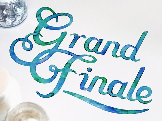
The inspiration for my final outcome was this poster using watercolour paints. The reason why I liked this was because of the effect that the colours merged together giving the paper and words a textured feel. I really like the this design, because I feel I can benefit the song lyrics. I think this because of the way that the theme is love, hate, heartbreak using watercolour paints it can almost look like someone has been crying on the page. The colours I want to use will hopefully work well with the lyrics that I have chosen.

I am really happy with my final outcome of six posters. I feel that i have worked really hard on this project and really have developed on my technical skills. I am glad that I chose to work with typography because I will thats were I am strongest, in experiments and skills. Also the songs that I picked out to make them into a poster work well with the watercolour effect.    

If I could improve on anything on my final outcome it would be to maybe make the posters slightly bigger so I could work more within them. For example having more space to work within the text giving the paint to merge more together more easily. Also maybe expanding my ideas by making a t-shirt or a bag to go with the posters. 

Overall I really enjoyed the project because it was something that I chose to do and I felt more confident in creating more than one thing. In this project I think that I have taken my time to develop ideas, from the font I would use to the final technique that I would carry out on to the posters. I also developed skills within experiments that I made from digital to handmade. Hopefully I will be able to use these techniques or experiments in the exam project.

Wednesday, 23 January 2013

Final Outcome

Below are the six poster that I have created from tracings, to watercolours to a slight editing of the page and colour. Even though I have altered the colours from the original you can still see the effect of the watercolour and brush strokes on the page. The reason why I changed the colours on photoshop was because i though that I would look better if half of the poster had the same scheme. So you have 3 with pinks and oranges and the other 3 you have blues and greens. I think these colour combinations work really we together with in all the posters, because you can actually distinguish all of them between the colours and the font I have used. Once I was happy with the editing stages, I printed them out on to A3 cartridge paper to get a better finish. Hopefully all my poster will catch peoples attention when they look at them. 2      


Tuesday, 22 January 2013

Progress of poster

Here is the progress of how I create my final outcomes of posters. I firstly started of with making tracings of the text I though worked well with the lyrics. Then using water colour paints I painted onto the outline of the font onto water colour paper so it would work better. After choosing the colours that would suit the lyrics, I scanned the watercolour prints into photoshop and played around with the contrast of the colours. Hopefully with a lot more editing I will be able to get the right outcome that I want to achieve.     


Wednesday, 16 January 2013

Final Inspiration...


Here above is my final inspiration, for my final outcome. With this is the design outcome that I want to achieve, will test my technical skills and all push me further in experimental skills. The reason why I like this watercolour effect in the letters because it gives a lot more definition and instantly becomes more eye-catching. I want to use this effect in all of my six posters, but using a variety of typefaces and colours, to hopefully get a good result. If I have enough time during the exam I want to hopefully create something else that will involve the songs that I have chosen. 

Friday, 11 January 2013

Poster Analysis

Here are three poster designs that have really caught my eye. I am going top discuss what I think is the best design and what is the worst layout.


This first design is very colour orientated, meaning that there are lots of colours one on the page. That is what you first see when you look at it. The typeface that has been used is a little complicated to read in my opinion, because of the words are in white. The typeface is really fancy and has a really unique patter at the top and the bottom that gets be little distracted. The font that has been used as before is fancy, by it also has lots of different shapes that have be evolved into the words to get a more retro look about it. However, I find it hard to read not only because of the font a litre distracting, also because of the grey background that half of the letters are placed upon. As you look further down the page you can notice a little pink box, with the words 'Be Nice' written in it. When I fist looked at this poster I didn't automatically see the pink text box in the middle bottom of the page. All I noticed was the paint smudges in the top left hand corner, going into the white 'Work Hard' text in the middle. I do think this is a good poster layout design but i would like to think that, you would be able to capture all of the poster with one glance rather than having to take double glances as such.

    
This next poster is one of my favourites, not only because the watercolour design is something I am willing to achieve for my final outcome, but its how something so simple as just words and colour can look so pretty on a piece of paper. When I first so this poster, I didn't really think it would appeal to me so much. The way that the phrase is all the same size and typeface, really grabs your attention. The font that has been used is really elegant in the way that the serifs off the end of the letters all curl almost around to each other. The font is almost childlike in the way that it has been written/drawn onto the paper. Now the watercolour effect is really inspiring to see because the artist that has designed this must have taken ages to get this final effect. The water-colour appeals to me quite a lot because of how handmade it looks, and if you make a mistake on the page, with the paint and water, you can make that apart of you design. With this poster, the way that it has been presented is straightforward; by having the multicoloured phrase centred in the middle of the page, it will be instantly be captured when people are looking at it. 


My final poster analysis is of this very busy advertising poster. Now this design isn't my favourite out of the three but it does have its positives in my opinion. First of all what I like about this poster is the different typographic fonts there are in one design. All of the fonts are bold and instantly stand out front the page, and by having the colour as well adds a little more to the design. I like the background of the poster, because it looks almost rustic and a little old making a good contrast between the modern typography. However, I do feel that by having a lot of text on the page, gets really distracting to look at. The reason I say this is because when I look at it, I am drawn into the top of the page 'Recorder' and half way down the middle 'Pop Bitch', I think this because of the red that has been introduced into the words. I just feel that all the typographic fonts that are on the page, deserve to be on individual poster showing off them one by one, not on the same design getting over crowded.